

The Role of Color Psychology in Branding
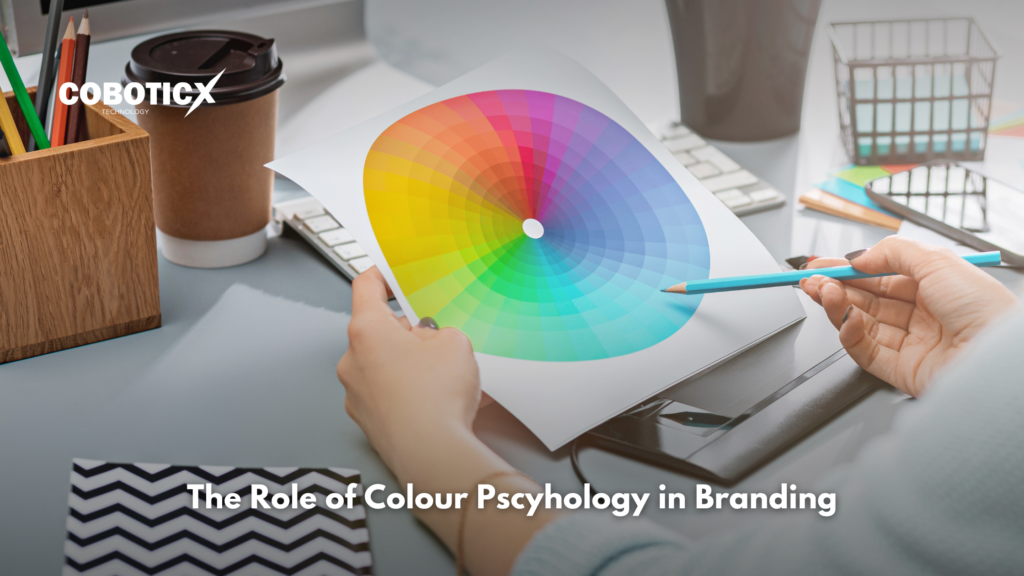
In the world of branding, color is more than just an aesthetic choice. It is a powerful tool that influences consumer perception, triggers emotional responses, and can significantly impact purchasing decisions. Color psychology in branding is the study of how colors affect human behavior and how businesses can use this understanding to create stronger connections with their audiences. From the logo design of a global tech giant to the packaging of a local food brand, colors are strategically chosen to convey specific messages. . The Science Behind Color Psychology Color psychology is rooted in the way colors influence human emotions and behaviors. Over the years, studies have shown that colors can evoke certain feelings and reactions. Our brain processes colors instantly, with subconscious associations linking them to specific traits or moods. These reactions can vary depending on cultural background, personal experiences, and context, but certain colors tend to elicit consistent emotional responses across the board. For example, the color red is often associated with energy, excitement, and urgency, which is why it’s commonly used in clearance sales or by fast food chains. On the other hand, blue tends to evoke feelings of trust, calmness, and professionalism, making it a popular choice for financial institutions and technology companies. How Different Colors Influence Branding To understand how to effectively use color in branding, it’s essential to recognize the psychological and emotional impacts of each color. Let’s break down the meaning behind some of the most popular colors used in branding: 1. Red – Energy, Passion, Urgency Red is one of the most powerful and attention-grabbing colors. It’s often associated with energy, passion, and excitement. It also stimulates appetite, which is why it’s frequently used by food brands like Coca-Cola, McDonald’s, and KFC. Red can also create a sense of urgency, making it a common choice for sale signs, clearance promotions, and call-to-action buttons. Brands that use red: Coca-Cola, McDonald’s, Target, Netflix. 2. Blue – Trust, Calm, Professionalism Blue is often considered a color of trust and professionalism. It exudes calmness, stability, and dependability, making it an ideal choice for businesses in the financial, healthcare, and technology sectors. It’s no surprise that companies like American Express, IBM, and Facebook rely on blue in their branding to project security and reliability. Brands that use blue: IBM, Facebook, American Express, Dell. 3. Yellow – Optimism, Happiness, Attention-Grabbing Yellow is a color that radiates positivity and energy. It’s often associated with optimism, happiness, and creativity. Because it grabs attention quickly, it is commonly used in advertisements, logos, and signage. However, when overused, yellow can be overwhelming, so it’s important to balance it with other colors. Many brands use yellow to stand out or convey a sense of fun and innovation. Brands that use yellow: McDonald’s, Snapchat, IKEA. 4. Green – Growth, Health, Sustainability Green is universally linked with nature, growth, and health. It’s often used by brands in industries like health, wellness, and organic foods. It also conveys sustainability and environmental responsibility, making it the go-to choice for eco-friendly brands. Whether promoting healthy lifestyles or green energy solutions, green evokes a sense of harmony and renewal. Brands that use green: Whole Foods, Starbucks, Spotify. 5. Purple – Luxury, Creativity, Wisdom Purple is a color associated with royalty, luxury, and sophistication. It’s often used by high-end brands to project exclusivity and elegance. In addition, purple can evoke creativity, wisdom, and spirituality, making it a popular choice for artistic and creative industries. Brands that want to convey a sense of luxury or creativity often turn to purple. Brands that use purple: Hallmark, T-Mobile, Yahoo. 6. Orange – Fun, Creativity, Enthusiasm Orange is a vibrant, energetic color that combines the warmth of red with the cheerfulness of yellow. It’s often used by brands that want to appear playful, energetic, and innovative. Orange can stimulate excitement and creativity, making it a popular choice for tech companies, entertainment, and creative agencies. It’s an excellent color for promoting enthusiasm and fun. Brands that use orange: Fanta, Nickelodeon, Home Depot. 7. Black – Sophistication, Power, Elegance Black is timeless, sophisticated, and powerful. It is often used to convey luxury, authority, and elegance. When paired with gold or silver, black can communicate exclusivity and high-end appeal. It’s also commonly used in minimalist designs to create a sleek, modern look. Brands that use black: Chanel, Nike, Apple, Mercedes-Benz. 8. White – Simplicity, Purity, Cleanliness White is a color that symbolizes simplicity, purity, and cleanliness. It is often used by brands in the health, beauty, and technology sectors to convey a sense of modernity and clarity. White can help make a design feel fresh, open, and uncluttered, allowing other elements to stand out. Brands that use white: Apple, Tesla, Adidas, The Gap. The Role of Color in Brand Consistency Once a brand establishes its color palette, it’s essential to maintain consistency across all marketing materials, from logos and websites to packaging and social media profiles. Consistency in color usage helps build recognition and reinforces the brand’s identity. For example, when you see a red and white logo, you likely think of Coca-Cola. Similarly, when you encounter a blue-toned website with a professional design, you might immediately associate it with a reliable financial institution like PayPal or American Express. By sticking to a defined color scheme, brands can create a cohesive and memorable visual identity that helps them stand out in a crowded marketplace. Conclusion Color psychology plays a crucial role in branding by influencing how consumers perceive a brand and make purchasing decisions. By understanding the emotional impact of different colors, businesses can strategically choose colors that align with their brand’s values, evoke the right emotions, and connect with their target audience. Whether you’re launching a new brand or considering a rebranding, color should be an essential part of your strategy. A thoughtful approach to color can help you communicate your message clearly and build a strong, lasting connection with your customers.